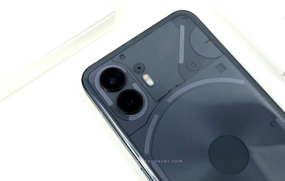
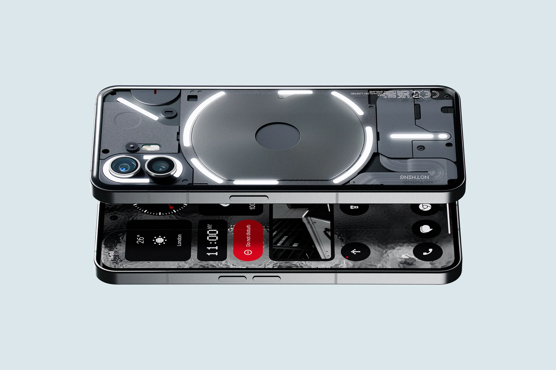
Hey folks, so let me spill the tea on the Nothing Phone (2). I’ve been rocking it for a few weeks now, and I gotta say, I was pretty stoked to upgrade from the Phone (1). Initially, I had a bit of FOMO because it was exclusively dropping in the Philippines through Digital Walker, but I finally got my hands on it, and boy, was it worth the wait!
The Phone (2) keeps that sleek vibe of its predecessor but in a bigger, beefier package. You know, the kind that makes you go, “Okay, they mean business.” After spending some quality time with it, I can confidently say I’m on Team Nothing.
First off, the display. We’re talking a massive 6.7″ OLED screen with this snazzy LTPO panel. And the refresh rate? Oh, it’s a wild ride from 1Hz to 120Hz, so smooth transitions are the name of the game. Now, the real MVP here is the upgraded Snapdragon 8+ Gen 1 under the hood, kicking the Phone (2) straight into flagship territory. We’ve leveled up, folks.
Battery-wise, they’ve thrown in a slightly larger 4,700mAh one. A little more juice for your daily adventures. Oh, and it’s got a bit more splash resistance, too – from IP53 to IP54. So, you can dance in the rain or handle a coffee spill without breaking a sweat for about 10 minutes. Not bad, right?
Now, no gadget is perfect, and the Nothing Phone (2) isn’t exempt from that rule. Sure, it’s got swag, style, and a chip that means business, but does it really deserve the spotlight it’s getting? Buckle up, ’cause I’m diving deep into that in our full review.
Unboxing the Nothing Phone (2)
Alright, let me spill the tea on Nothing’s Phone 2 unboxing – and trust me, it’s not your usual deal. Now, usually, unboxing experiences are as exciting as watching paint dry, especially with those bland white boxes major brands dish out. But hold up because Nothing’s playing a different game.
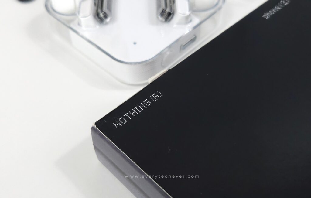
The Phone 2 struts in a slick, square box with a one-time peel tab, just like its sibling. Last year, you’d pop open the gray outer box, and boom, there’s your phone. But this time, it’s a double whammy. Take off the thin gray box, and inside, you’re met with a sturdier white box rocking textured patterns on the front flap like it’s about to drop a mixtape.
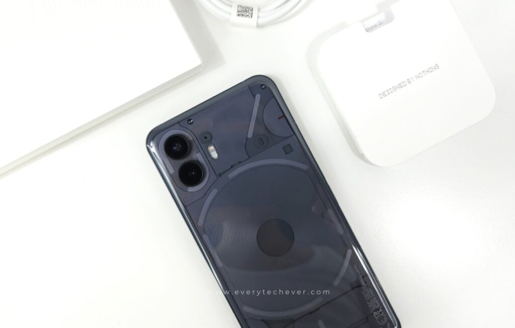
Now, here’s where it gets fancy. The white box is like a jewelry box on steroids, flipping open to reveal the Phone 2 and all its accessories laid out like they’re posing for a tech magazine cover. And kudos to Nothing for being eco-warriors – the whole shebang is plastic-free, with 60% of it being recycled materials. Sustainability and style? Sign me up.
Sure, there’s no charger in the mix, but you get a snazzy USB-C cable and a SIM ejector tool. Can we talk about the transparent elements of these accessories? It’s like Nothing’s way of saying, “Yeah, we’re different, deal with it.” So, big props to Nothing for nailing the packaging game without wrecking the planet.
Nothing Phone (2) Specifications
| Dimensions: | 161.2 x 76.4 x 8.6 mm |
| Weight: | 201.2 g |
| Screen: | 6.7-inch LTPO OLED display, 1600 nit brightness |
| Resolution: | 2412 x 1080 pixels |
| Refresh rate: | 1-120Hz |
| CPU: | Qualcomm Snapdragon 8 Plus Gen 1 |
| RAM: | 8GB / 12GB |
| Storage: | 128GB / 256GB / 512GB |
| OS: | Nothing OS 2 with Android 13 |
| Rear Camera: | 50 MP, f/1.9, 1/1.56″, 1.0µm, PDAF, OIS |
| Ultrawide camera: | 50 MP, f/2.2, 114˚, 1/2.76″, 0.64µm |
| Front Camera: | 32 MP, f/2.5, 1/2.74″, 0.8µm |
| Battery: | 4700 mAh |
| Charging: | 45W wired; 15W wireless; 5W reverse wireless |
| Colors: | white, gray |
Design and Build
Let’s get real about the Nothing Phone 2’s vibe – it’s like catching up with a good friend who’s had a glow-up since the last time you hung out. The look and feel? Familiar, but with some cool upgrades you can’t ignore.
First off, it’s a smidge bigger, flaunting a 6.7-inch screen compared to the OG’s 6.55 inches. Now, I know we’re talking about a mere 0.6mm wider and 0.3mm thicker, so you might not notice it at first, but it’s there.
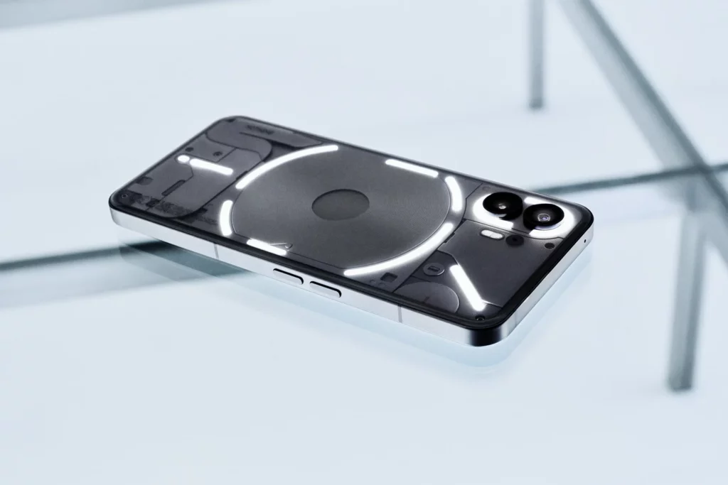
The real head-turner? That see-through back, made from recycled plastic, is now rocking a subtle curve on all four edges. It’s like they gave it a comfy hug without ditching that sleek, iPhone-ish vibe we love. And guess what? More recycled bits mean a lower carbon footprint – 53.45kg, to be exact. Props to Nothing for keeping it green.
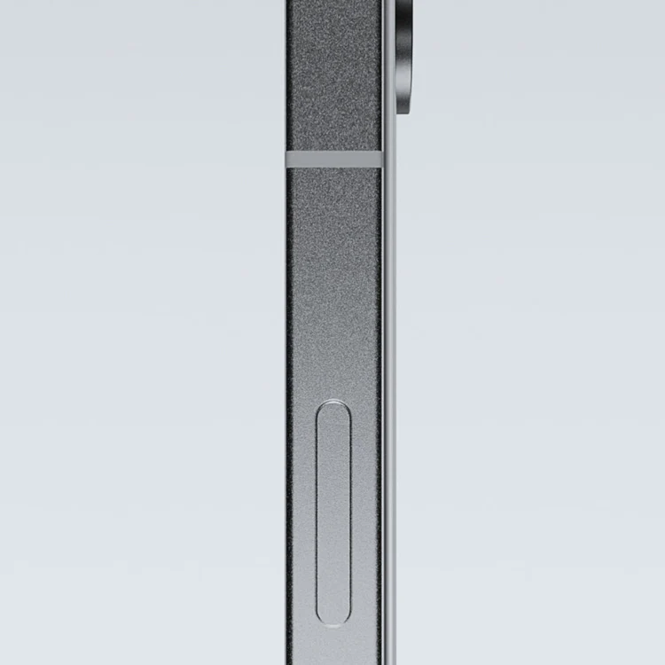
Crafted with Gorilla Glass on the back and a flat Corning-made screen, the Phone 2 scores in the durability department. Not gonna lie, wish they spilled the tea on which Gorilla Glass version, but hey, we can’t have it all.
Splash and dust resistance? They’ve upped the game to an IP54 rating – no deep-sea diving, but it can handle a splash or two. Oh, and those Glyph lights? You can play DJ with them through software. We’re diving deeper into that in the software section – trust me, it’s worth the hype.
Hold it, and you’ll feel that matte metal frame giving you a comfy grip. Volume keys are on the right; an extra mic is on top and below; we have the SIM tray, the primary mic, a USB-C port, and a second stereo speaker. It’s like the Phone 2’s got all its essentials lined up for a killer party.
Display
Let’s dive into the Phone 2’s visual playground – that 6.7-inch OLED display is a showstopper, rocking a sweet 120Hz refresh rate. It’s a tad bigger than its predecessor, and the selfie camera’s moved to the center – a cool departure from the usual top-left spot.
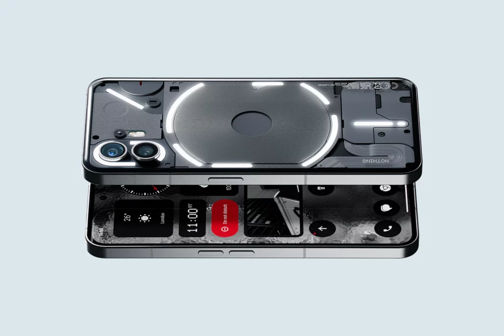
Now, this display is a feast for the eyes – vibrant colors, killer viewing angles, and that crispy 1080p resolution. Oh, and don’t forget the pre-installed plastic screen protector. Sounds good, right? Well, not so fast. My review unit’s protector got scratched up faster than you can say “screen time,” so I swapped it out for a Nothing-branded tempered glass. A bit extra on the cost, but hey, priorities.
Here’s the real game-changer – the Phone 2 rocks 2.5D glass with these elegant rounded edges on the back. It’s like they went for the sleek look without sacrificing that comfy grip. No awkward edges messing with your hand’s vibe.
And the brightness? A whopping 1,600 nits, plus that variable refresh rate from 1Hz to 120Hz – industry standard in 2023, but let’s be real, it still makes everything look better. So, yeah, the Phone 2’s display game? Stronger than your morning coffee.
Camera
Let’s spill the tea on the Nothing Phone 2’s camera game – and oh boy, it’s a ride. So, they’ve upgraded to the Sony IMX890 sensor, and while the specs might not scream “top-tier,” the real magic happens with those software tweaks. Fun fact – the folks behind this software magic? Mostly ex-OnePlus engineers, so you know they mean business.

Is this the HDR game they’re pushing? A game-changer. It’s like a wizard blending multiple exposures to give you pics that pop. Colors? Vibrant with a touch of warmth. The skies? Always on point. But, gotta keep it real; shadows might get a bit extra, losing some contrast.
Let’s talk about the main camera – default setting at 12.5MP, and the results. Pure eye candy. Sharp, detailed, and surprisingly minimal noise. And that contrast? Off the charts. The colors are spot-on, maybe a tad extra on the saturation, but it works. No heavy-handed smoothing or sharpening here – just natural vibes.


Zoom game? Super High Res 2x zoom nails it. Details for days, and it doesn’t feel like they went crazy with digital zooming. But, here’s the twist – the 50MP output doesn’t quite hit the same heights. It’s decent, but 2x zoom shots might steal the show.
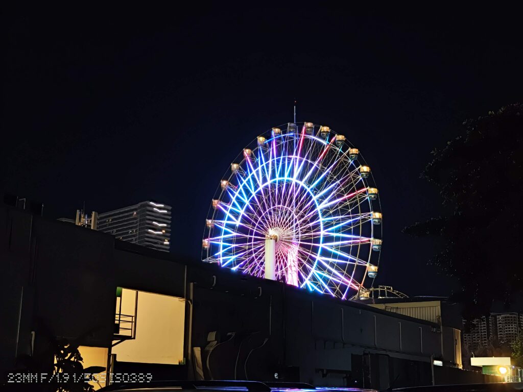


Ultrawide shots? Aces. Well-corrected corners, great detail, and that autofocus? A game-changer for close-ups. Macro shots are next level – outshining most smartphones out there.


Front camera – 32MP, and it’s doing the job. Good exposure, skin tones on point. Just remember, it’s fixed focus, and the video cap is at 1080p.


Now, tricky lighting situations? Things get a bit dicey. You might lose some detail in high-contrast scenarios. But when the sun dips, Auto Night Mode steps up. Results? Exceptional. Detailed, sharp, minimal noise, and a dynamic range that’s a chef’s kiss.
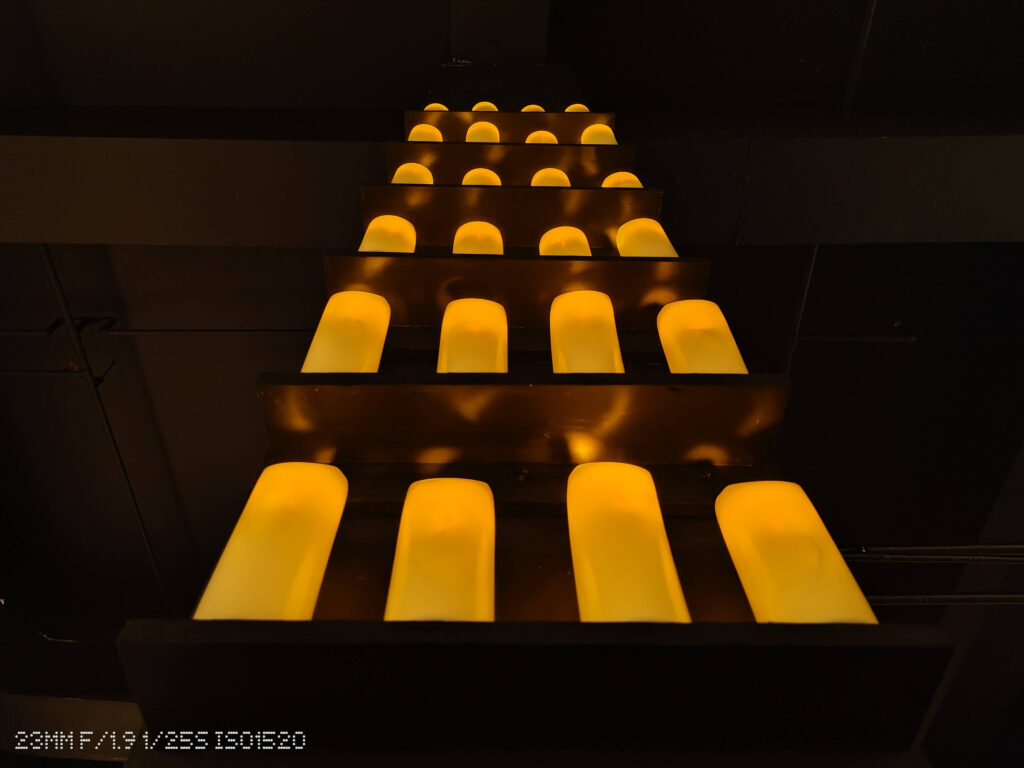


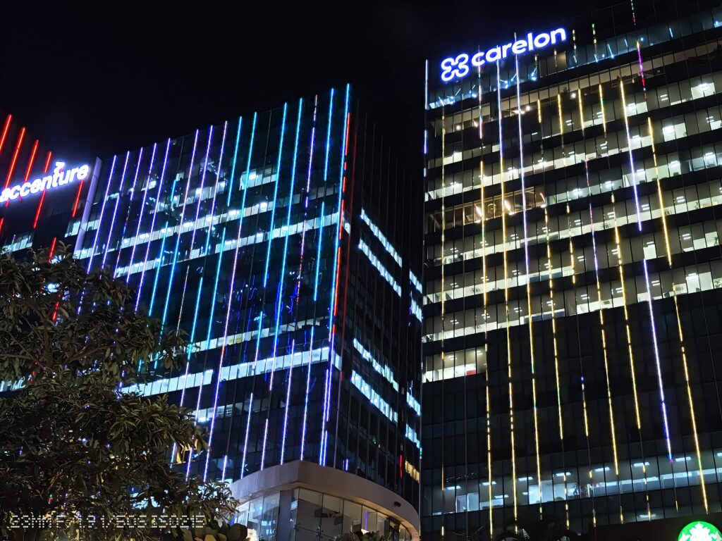
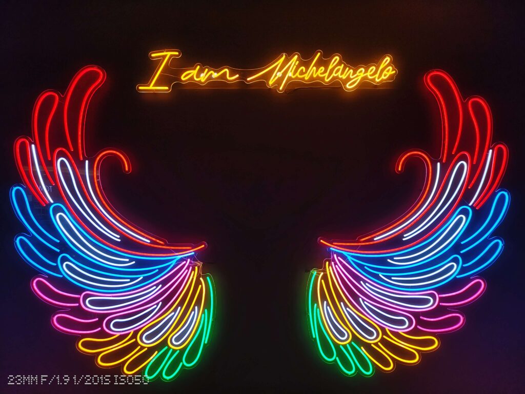
The ultrawide camera is a solid performer, but the smaller sensor can get a bit soft in iffy lighting. But hey, Nothing’s still got the color science game strong.


In a nutshell, the Nothing Phone 2’s camera is like having a versatile artist in your pocket – it nails most things and surprises you with a masterpiece now and then. Here are more shots for you to enjoy.


Performance
The Nothing Phone 2 is powered by a Snapdragon 8+ Gen 1 chipset coupled with either eight or 12 gigabytes of RAM. This particular chipset was Qualcomm’s flagship CPU for 2022, seen in devices like the Samsung Galaxy Z Fold 4, Xiaomi 12s Ultra and the OnePlus 10T. While it may not match the power of this year’s Snapdragon 8 Gen 2, the Phone 2 still impresses with its exceptional speed and responsiveness. Applications open swiftly, multitasking is seamless, and gaming performance remains consistently smooth.
Alright, let’s talk money and specs. My hands-on buddy here is the $699 flavor with a sweet 12 gigs of RAM. Now, being real with you, unless you’re planning some heavy-duty tech acrobatics, those extra four gigs might just be chillin’ in the background, not stealing the show.
But here’s the scoop – if your storage needs are more “I just need a solid chunk,” the base model at $599 is probably your vibe. Unless you’ve got a stash of cat videos or an obsession with storing every meme in existence, that 128GB should cover your daily hustle just fine. Save those extra bucks for some cool accessories or, you know, snacks. Priorities, right?
Nothing OS 2.0
Alright, let’s dive into the tech heart of the Phone 2 – the Nothing OS 2.0, dancing on the beats of Android 13. It’s like the DJ dropped a sleek and minimalist track that sets the vibe for this whole shindig.
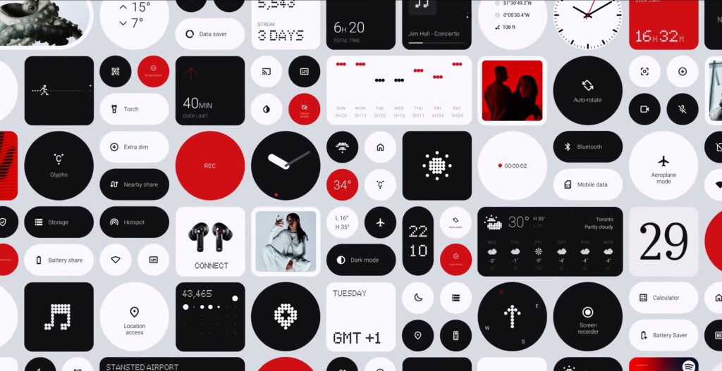
From the get-go, the setup caught my eye. App icons play it cool in monochrome, with no labels beneath like we’re used to. So, when you’re staring at that YouTube icon, you gotta know it’s YouTube without any text spelling it out. And the widgets and folders? They’re like the rockstars of your home screen, standing out a bit more than the usual crowd.
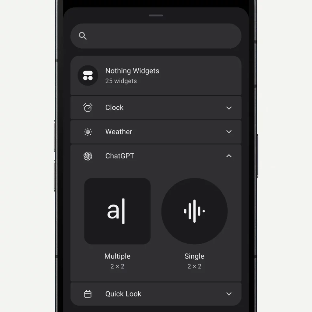
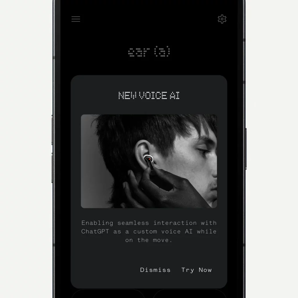
Now, Nothing’s got a philosophy here – it’s all about giving you a clean, personalized space without turning your screen into a logo jungle. You dig that concept, or you might think it’s just Carl Pei and the gang doing their marketing dance – it depends on your vibe, really.
The Glyph
Alright, let’s talk about the cool vibes the Phone 2 is bringing back with Nothing’s Glyph interface. Picture this – under that transparent back glass, you’ve got LED strips lighting up when your phone’s feeling chatty. And here’s where it gets spicy – you can customize these lights and make them dance to the beat of different notifications. It’s like having your own light show, thanks to Nothing’s Glyph Composer feature.
Remember the Flip to Glyph moves from Phone 1? Well, it’s back, baby! Lay your Phone 2 facedown, and it hushes up the notifications, letting those Glyph lights steal the show.
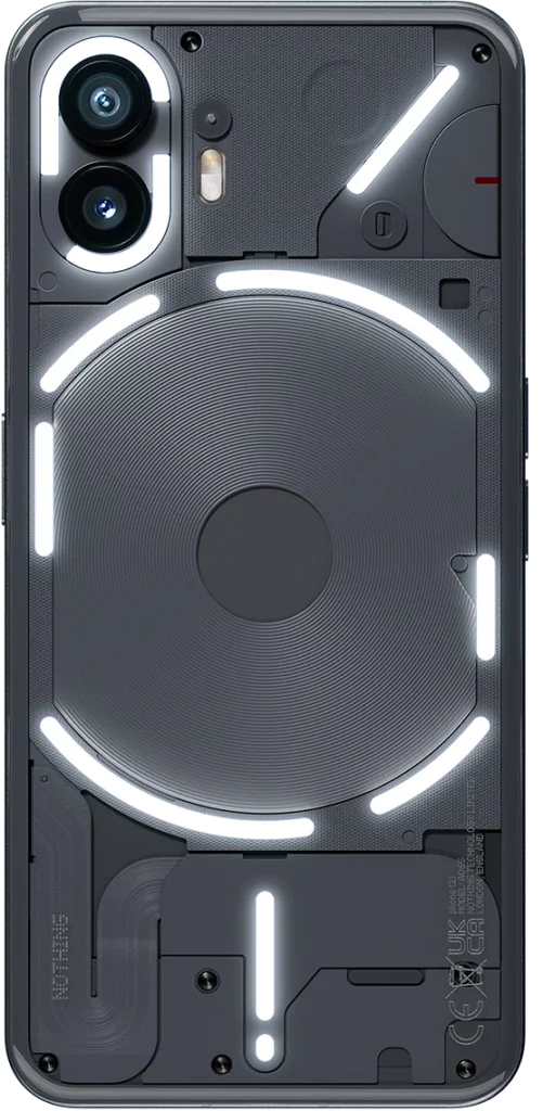
Now, the new kids on the block – Essential Notifications. You pick any app, tag its notifications as “Essential,” and bam, one of those Glyph strips lights up and stays lit until you deal with the notification. Super handy when you want to keep things low-key but not miss out.
And the Glyph Timer? It’s like having a progress bar for your timers using one of those strips. Quick heads up – it’s a bit choosy, only working with timers set from specific widgets or your phone’s settings, not the Clock app. Plus, there’s an experimental feature for Uber – using the Glyph interface to show your ride’s progress. Sounds nifty, but I haven’t given it a spin yet. Old habits, you know – still glued to the screen while waiting for my ride.
So, sure, you could argue a single LED would do the job, but where’s the fun in that? The Glyph lights might be a bit of a show-off, but they bring this unique, eye-catching element to the Phone 2. It’s like the sprinkle of magic on an already awesome device – doesn’t change the game, just makes it more interesting.
Competition
As the smartphone market continues to evolve, the Nothing Phone 2 has made quite an entrance with its unique design and features. However, let’s delve into the landscape of alternatives that might give the Nothing Phone 2 a run for its money. From established players to emerging contenders, we’re taking a closer look at the competition.
Samsung Galaxy S23
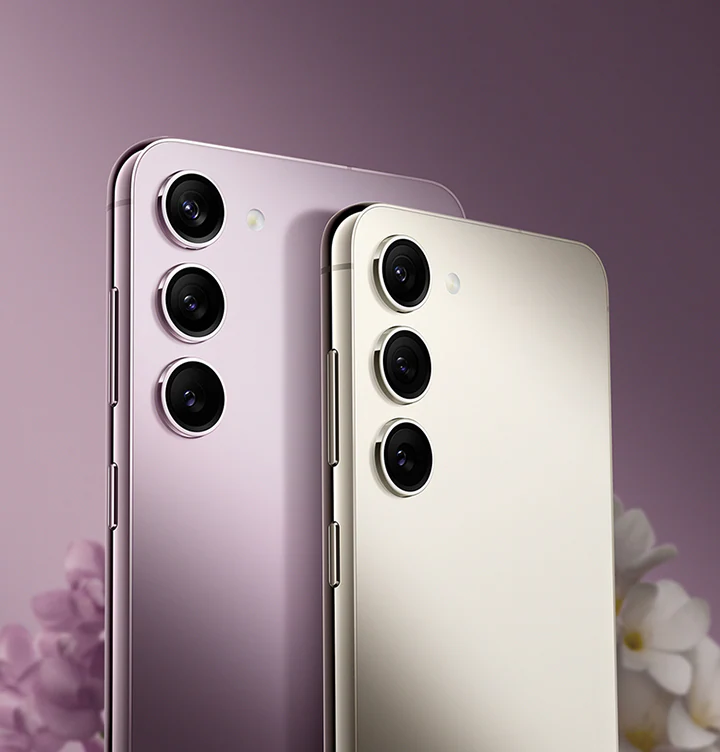
Samsung’s Galaxy S23 is a heavyweight in the Android arena. Boasting a stunning display, robust camera system, and top-tier performance powered by the latest Exynos or Snapdragon processors, the Galaxy S22 is a strong competitor. The One UI brings a polished and feature-rich user experience, while Samsung’s reputation for quality is well-established.
Google Pixel 7
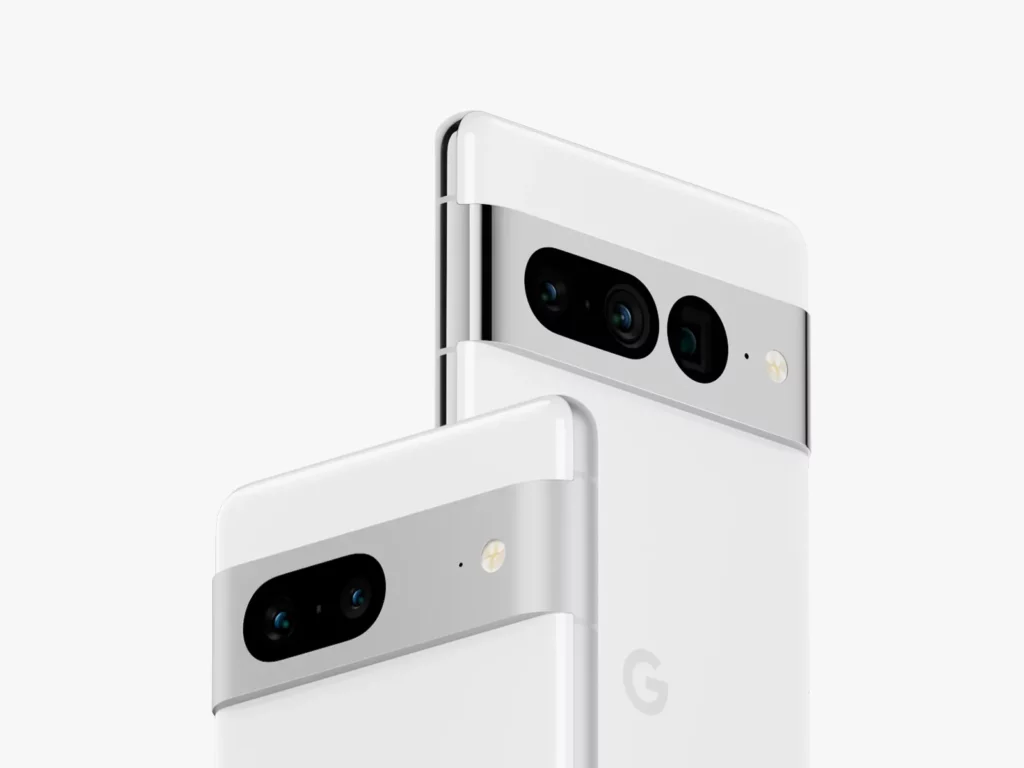
The Pixel 7 series from Google continues to impress with its emphasis on photography. With the renowned Pixel camera capabilities, stellar software optimization, and timely updates, the Pixel 7 is a solid contender. Google’s clean Android interface and integration of AI features make it a compelling choice for those seeking a seamless and straightforward user experience.
iPhone 13
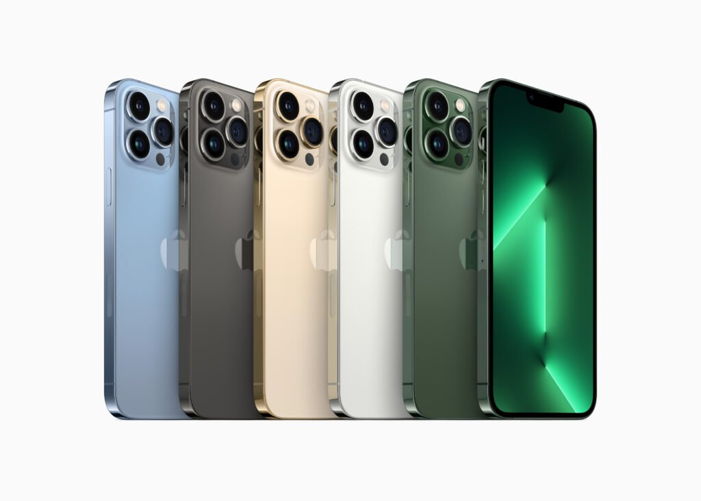
For those deeply embedded in the Apple ecosystem or contemplating a switch, the iPhone 13 is a strong rival. With its iconic design, powerful A15 Bionic chip, and a camera system that consistently delivers impressive results, the iPhone 13 is a flagship device that caters to iOS enthusiasts. The tight integration of hardware and software is a hallmark of the iPhone experience.
OnePlus 10
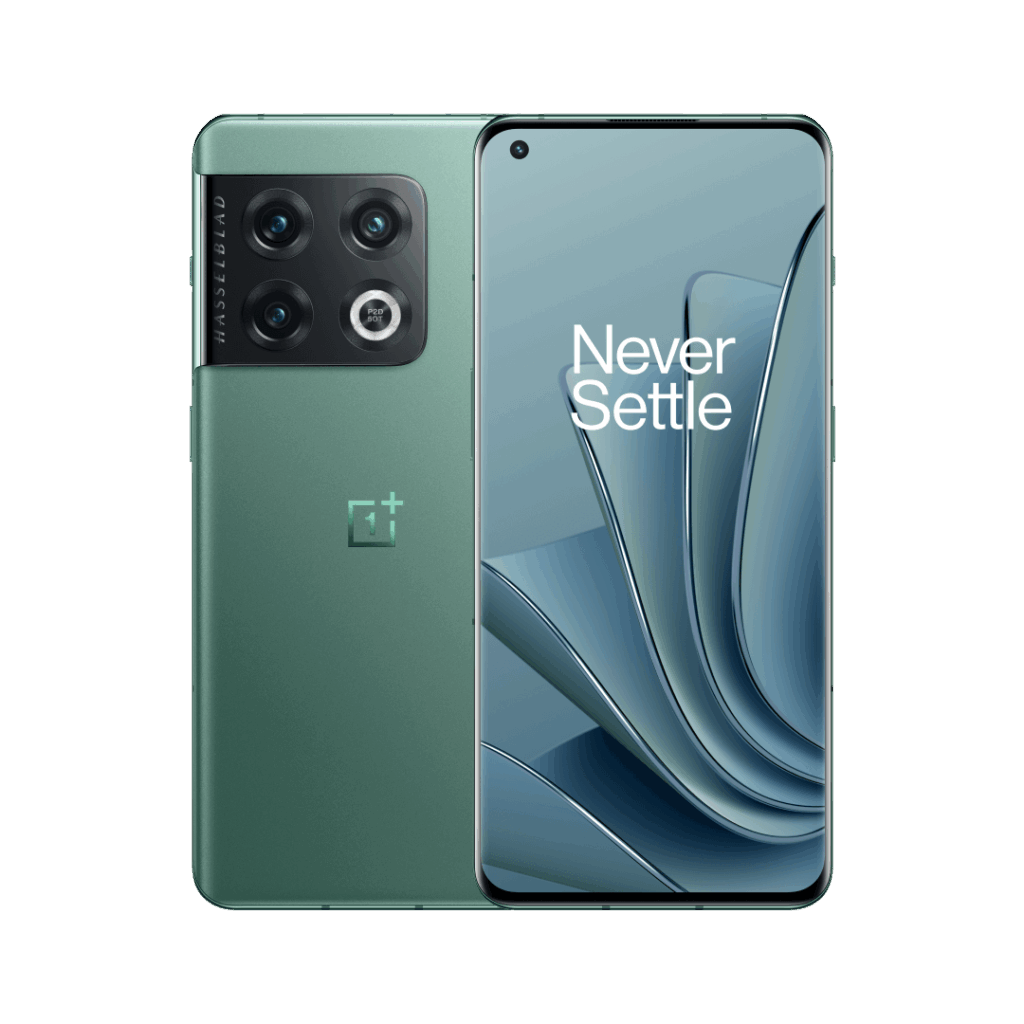
Another player in the Android arena, the OnePlus 10, brings a combination of sleek design, powerful performance, and an OxygenOS interface known for its customization options. Its camera delivers exceptional image quality. The main sensor captures images with impressive clarity, accurate colors, and a wide dynamic range. OnePlus has a legacy of delivering flagship-level features at a competitive price point, making the OnePlus 10 an attractive alternative for those seeking high-end specifications without breaking the bank.
Will the Nothing Phone (2) be your EveryTechEver?
The Nothing Phone (2) steps into the scene as a captivating sequel, carving out a tempting niche in an overly crowded market, especially within the €600 range. What sets it apart, and what used to be exclusive to Phone (1), is the charismatic Glyph UI. To sweeten the deal, the LED functionality has been given an expansion – a smart and convenient way to keep tabs on your phone without having to lay eyes on the screen.
Size does matter, at least in the case of the Phone (2) – a larger and brighter LTPO OLED display steals the spotlight with a refresh rate that dances to the rhythm of your needs, a refreshing upgrade over its predecessor. The real star, however, is the Snapdragon 8+ Gen 1 flagship chipset, turning the Phone (2) into a multitasking maestro, effortlessly handling work and play, including some serious gaming sessions.
But that’s not where the upgrades stop. The Phone (2) flaunts improved battery life, stereo speakers belting out richer audio, and a camera setup that’s gotten a significant facelift, producing better photos and videos across the board. Oh, and let’s not forget the zippy 45W charging – a practical lifesaver in the hustle and bustle of daily life.
Navigating the Nothing OS 2.0 is a seamless experience, like a breeze on a sunny day – clean, simple, and fast. It adds an extra layer of appeal to an already impressive package.
Of course, no superhero is without its kryptonite. The Phone (2) falters on the gaming front, lacking support for High Frame Rate gaming – a bit of a downer for the gaming aficionados out there. Also, despite the improved ingress protection rating, water resistance remains a missing feature.
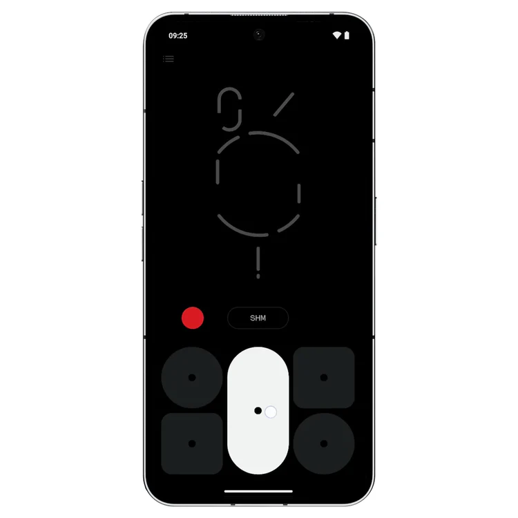
Now, let’s talk Glyph – the heart and soul of the Nothing Phone. It’s a love-it-or-leave-it affair. If Glyph strikes a chord with you, the Phone (2) is a standout. If not, we’ve done the legwork on alternatives that might just tickle your fancy and fit snugly into your budget.
But if you’re yearning for a breath of fresh air, a sprinkle of innovation in a market that often feels a tad too predictable, the Nothing Phone (2), or even its predecessor (1), won’t let you down. On the contrary, the Phone (2) brings a thoughtful blend of features, a dash of premium, and a generous serving of innovation to the table. So, consider it. Heck, even buy it. Because in the realm of smartphones, where the old times are often glorified, the Nothing Phone (2) begs to differ.


