The Google app might not be the sleekest of Google’s offerings, but a recent carousel redesign on Android makes it look a bit more polished.
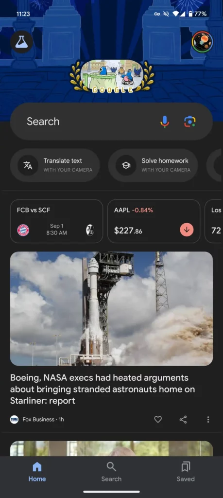
Before, you had five pill-shaped shortcuts under the Search bar, each with an icon, name, and brief description.
- Search photo: From your library
- Translate text: With your camera
- Solve homework: With your camera
- Identify song: By listening
- Shop for products: In your screenshots
The text, with its mix of sentence and uppercase styles, felt a bit messy, and the double carousel design made the app look pretty cluttered.


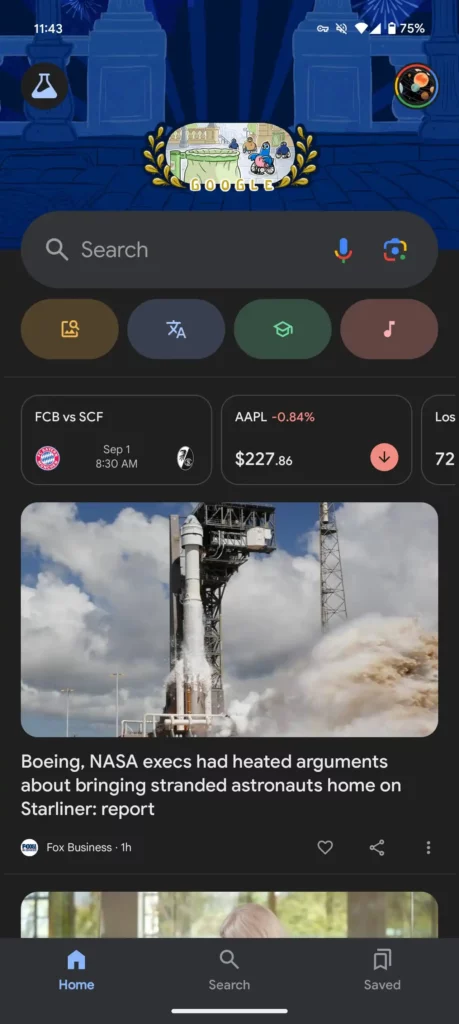
Google is now simplifying those shortcuts by using just icons, making them smaller, and giving them colorful backgrounds that really stand out. Most of these icons open Google Lens, with the last one for Sound Search. The icons are clear enough to show what each function does.
A great feature of this new design is that you can see all four shortcuts at once. You only need to scroll if you’ve recently taken a screenshot that needs analyzing. Plus, the layout now looks less like a carousel, so the “your space” cards below are more noticeable and easier to glance at.
This design has already been in the Search app on iOS for a while. We’re seeing the same carousel redesign in the latest app beta (version 15.34), though it’s not yet available in the stable version.
Google LLC is an American multinational corporation and technology company focusing on online advertising, search engine technology, cloud computing, computer software, quantum computing, e-commerce, consumer electronics, and artificial intelligence.


